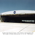
 that represented the National Advisory Committee for Aeronautics for 43-years, was removed from the front of the main building at the NASA High Speed Flight Station, making room for a new insignia belonging to the National Aeronautics and Space Administration.
This NASA Insignia was created by retiree James J. Modarelli, former Chief of Technical Publication of Lewis Research Center; designed by the Army Institute of Heraldry; and approved by the Commission of Fine Arts and the NASA Administrator. This official insignia of the NASA is a dark blue disc with white stars. The white hand-cut letters “NASA” are in the center of the disc and are encircled by a white diagonal orbit. A solid red “V” shape appears behind and in front of the letters and extends beyond the disc. The “V” is patterned after an actual wing design being tested by NACA researchers during the late 1950s. This insignia was used from 1958 to 1975 and was affectionately known at the “meatball,” returning to NASA Insignia status in 1992.
In the photo above the NASA Logotype appearing on the front of the main building replaced the NASA Insignia. The NASA Logotype was developed under the Federal Design Improvement Program initiated by the President in 1972, with the preferred color being red. It was approved by the Commission of Fine Arts and the NASA Administrator in October 1975. It symbolized NASA’s role in aeronautics and space from 1975 to 1992 and has since been retired. In the logotype, the letters “NASA” are reduced with the strokes being of one width; the elimination of cross strokes in the two “A” letters imparts a quality of uniqueness and contemporary character. This familiar logo was known as “The Worm”.
On May 22, 1992, NASA Administrator Daniel S. Goldin announced a change in the NASA Insignia: “it seems only fitting that the original NASA Insignia be a part of our Future.” So once more the “meatball” serves as the official NASA Insignia.")
WIKIARCHIVES.SPACE
The Human Spaceflight Archive
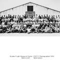
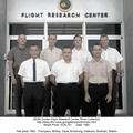
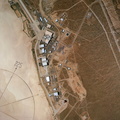
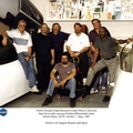
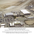
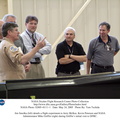
In 1985 the NASA Ames-Dryden Flight Research Facility employees and contractors gathered around the base of the X-1E for a picture. The X-1E is mounted in front of building 4800, the main building at Dryden.


Information
- Taken in
- Edwards Air Force Base
- Author
- NASA
- Description
-
In 1985 the NASA Ames-Dryden Flight Research Facility employees and contractors gathered around the base of the X-1E for a picture. The X-1E is mounted in front of building 4800, the main building at Dryden.
On Wednesday, October 1, 1958, the NACA yellow-backed winged symbol (see E-33718) that represented the National Advisory Committee for Aeronautics for 43-years, was removed from the front of the main building at the NASA High Speed Flight Station, making room for a new insignia belonging to the National Aeronautics and Space Administration.
This NASA Insignia was created by retiree James J. Modarelli, former Chief of Technical Publication of Lewis Research Center; designed by the Army Institute of Heraldry; and approved by the Commission of Fine Arts and the NASA Administrator. This official insignia of the NASA is a dark blue disc with white stars. The white hand-cut letters “NASA” are in the center of the disc and are encircled by a white diagonal orbit. A solid red “V” shape appears behind and in front of the letters and extends beyond the disc. The “V” is patterned after an actual wing design being tested by NACA researchers during the late 1950s. This insignia was used from 1958 to 1975 and was affectionately known at the “meatball,” returning to NASA Insignia status in 1992.
In the photo above the NASA Logotype appearing on the front of the main building replaced the NASA Insignia. The NASA Logotype was developed under the Federal Design Improvement Program initiated by the President in 1972, with the preferred color being red. It was approved by the Commission of Fine Arts and the NASA Administrator in October 1975. It symbolized NASA’s role in aeronautics and space from 1975 to 1992 and has since been retired. In the logotype, the letters “NASA” are reduced with the strokes being of one width; the elimination of cross strokes in the two “A” letters imparts a quality of uniqueness and contemporary character. This familiar logo was known as “The Worm”.
On May 22, 1992, NASA Administrator Daniel S. Goldin announced a change in the NASA Insignia: “it seems only fitting that the original NASA Insignia be a part of our Future.” So once more the “meatball” serves as the official NASA Insignia.
- Created on
- Albums
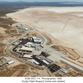
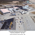
- US SPACE PROGRAM / FACILITIES / DRYDEN/ARMSTRONG CENTER
- Source link
- https://www.dfrc.nasa.gov/Gallery/Photo/People/index.html
- Visits
- 21
- Rating score
- no rate
- Rate this photo
- License
- Public Domain
- Modified by WikiArchives
- No (original)
- Downloads
- 0
Powered by Piwigo